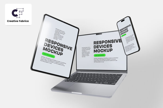
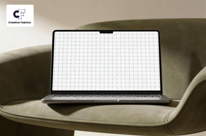
Responsive Laptop, Tablet & Phone Mockup
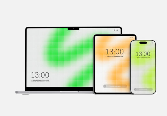
A responsive laptop, tablet, and phone mockup featuring a MacBook, iPad, and iPhone arranged in a clean presentation scene. Perfect for showcasing responsive websites, web design projects, mobile apps, UI/UX concepts, landing pages, and cross-device interfaces. The editable PSD file includes several smart objects and color layers for customizing the screen content and overall appearance. High-resolution and print-ready, the mockup measures 6000 × 4171 px at 300 dpi.